Site Specific
Training Videos
Below you'll find access to the training videos we captured during your training session.
We've noted out below the different areas discussed and what time within the video they're discussed:
Part 1a: Overview of Craft Side Nav & Singles/Channel Entry Types
| Topic | Time |
|---|
| Craft Login & Setting a Password | 00:42 |
Part 1b
| Topic | Time |
|---|
| Backend Overview: Backend Navigation | 00:22 |
| Backend Overview: Entries & Entry Types | 01:35 |
Part 1c
| Topic | Time |
|---|
| Backend Overview: Entries & Entry Types | 00:40 |
| Backend Overview: Globals | 12:05 |
| Backend Overview: Assets | 40:38 |
| Assets: Replacing Assets | 45:11 |
| Entries: Titles & Slugs | 46:30 |
| Entries: Secondary Navigation | 55:15 |
| Entries: SEO Tab | 59:40 |
Part 2
| Topic | Time |
|---|
| Entries: Creating a New Entry | 00:14 |
| Entries: Duplicating an Entry | 06:25 |
| Entries: Previewing a Page | 08:50 |
| Entries: Modules | 10:00 |
| Modules: Module Test Page | 12:25 |
| Modules: Adding a Module Block | 15:25 |
Part 3
| Topic | Time |
|---|
| Modules: Adding Modules to Existing Page | 00:30 |
| Modules: Advanced Options | 04:55 |
| Help Section: Overview | 24:35 |
| School Recipes | 29:30 |
| Sitemap Areas Needing Attention | 34:15 |
Part 4
| Topic | Time |
|---|
| Singles, Structures & Channels Recap | 04:11 |
| Assets -> Documents: Adding New & Acquiring Link | 10:33 |
| Placing URL Links Recap | 12:50 |
| Assets -> Images: Using the Grid to Browse Images | 15:25 |
| Modules: "BB" Shortcut Recap | 17:00 |
| Modules: Images & Text Grid Recommendation | 23:20 |
| Secondary Navigation Recap | 28:23 |
| "Tertiary Page" Design vs. Overview Page Design | 31:52 |
Part 5
| Topic | Time |
|---|
| Image Size Guide Recap | 03:33 |
| Modules: Intro Image & Text Module vs. Image & Text Module | 04:27 |
| Tip: Watch Headers Being Bold | 09:50 |
| Tip: Copying & Pasting Info/Links Retains Old Styling | 10:55 |
| Headers & When to Use Them Recap | 13:41 |
| Modules: When to use the Banner Module | 21:15 |
| Advanced Options: Inner & Bottom Spacing Recap | 22:50 |
| Page Margins & Text Alignment Resulting in White Space | 27:25 |
| Help: Site Specific & Content Entry Sections | 33:14 |
| Modules: Text Module Pull Quotes vs. Testimonials Module | 36:18 |
| Reverting Pages Back to Previous Versions | 45:38 |
| Deleting Modules Recap | 47:17 |
| Saving Images for Web: Free Online Tool | 51:40 |
Module Stack
For ease of reference, visit the Full Module List Page in order to view what modules you can build a page with.
Secondary Navigation
The Secondary Navigation will automatically appear when 3 or more H2 titles appear on a page. In some instances, such as on an "Overview" page, you'll want to comment the Secondary Navigation out. In order to do this follow the steps below:
- Navigate to the page entry and open it.
- Select the "Meta" tab just below the page title.
- Change the "Meta-Subheader Anchors" to "Disabled."
- Save the page.
For a visual reference please click here.
Recipes
The Lunch Box's school recipes are unique in that the content is gathered from the OneSource Horizon Database. See below for certain details about the relationship between the two:
Editing the Copy of an Existing Recipe
Updating the copy of an existing recipe must be done in the OneSource Horizon Database. There is no way to do this within this Craft backend system. To find out how to do this please contact someone on the Chef Ann Foundation team.
Editing the Image* of an Existing Recipe
If you want to update an image of an existing recipe following the steps below:
- Crop the new image* according to the specs listed further down in this section.
- Save & Name the file of the new image with the Recipes "Item ID." (NOTE: All of the letters within the filename must be lowercase for this to work properly.)
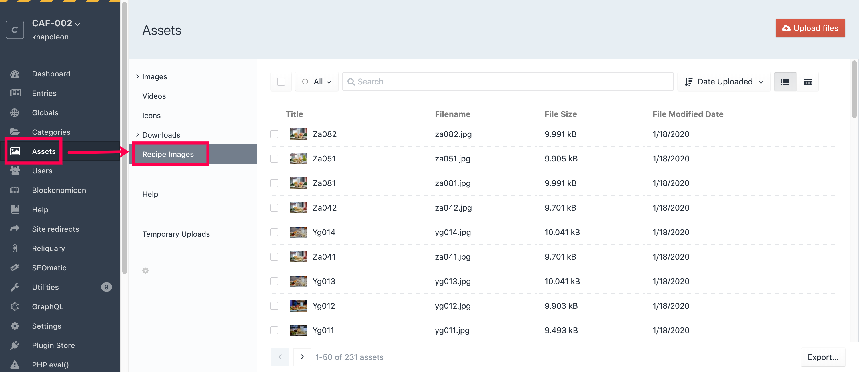
- Navigate to "Assets" in the left side nav of the Craft backend system.
- On the "Assets" page select the "Recipe Images"
- Drag the new image anywhere in the "Assets" window in order to upload it. Or you can also select the "Upload Images" button in the top right corner.
- When prompted with the question about replacing an already existing image with a new one say yes.
Check the recipe detail page to ensure that the intended image* is appearing on the page.
- Click here to access a visual reference.
NOTE: You don't always have to upload a photo as the asset for the recipe. You could also upload a different illustration from the generic one so long as it's named as the Recipes "Item ID."
Adding in a New Recipe
All of the individual recipes are brought into The Lunch Box website via the OneSource Horizon Database. When an admin adds a new recipe to the OneSource Horizon Database two things occur:
- A Recipe card/line item is added to the Recipe Overview page and auto-populates the card/line item for that recipe.
- A detail page for the new recipe is created and all of the content auto-populates on the page.
Adding in an Image* for New Recipe
In order to attach an image to a New Recipe that was entered into the OneSource Horizon Database follow the instructions below. There is no need to save the image within the OneSource Horizon Database, but if you want to for certain reasons that's fine. Just know that you must do the following in order for the entry to have a specific image attached to it. If an image* is not added to the Craft system then the entry will auto-populate with a pre-designated generic illustration.
- Crop the new image* according to the specs listed further down in this section.
- Save & Name the file of the new image with the Recipes "Item ID." (NOTE: All of the letters within the filename must be lowercase for this to work properly.)
- Navigate to "Assets" in the left side nav of the Craft backend system.
- On the "Assets" page select the "Recipe Images"
- Drag the new image* anywhere in the "Assets" window in order to upload it. Or you can also select the "Upload Images" button in the top right corner.
Check the recipe detail page to ensure that the intended image* is appearing on the page.
- Click here to access a visual reference.
NOTE: You don't always have to upload a photo as the asset for the recipe. You could also upload a different illustration from the generic one so long as it's named as the Recipes "Item ID."
Recipe Page Performance
The Recipe Search & Recipe Detail Pages rely on getting anything that hits an endpoint from the OneSource Horizon system, if that system itself is having trouble or is overloaded, those pages specifically may be slow or have problems.
At times, the system might have trouble running the queries to get the recipe ingredient information. Because of this, we've developed that section so that a note will appear when the recipe ingredients list is unavailable. The PDFs and Excel file will also be unavailable for a user to download at that time.
SEO
The "SEO" for each page can be accessed by doing the following:
- Navigate to the page entry and open it.
- Select the "SEO" tab just below the page title.
We've outlined below what each section is in here depending upon what you're looking do.
Title
This will auto-populate with what the "Title" is of your entry and thus will be what your page title is on the front end for users to see.
SEO Meta -> SEO Title Source
This does not need to be filled out unless you want to override what's appearing in the "Title" field above for your page title. We recommend that this section not be touched except for in the following scenario:
- Homepage isn't the best descriptive title for Google Search Results but is descriptive and good for the backend.
- Because of this, you should override it with custom text.
SEO Descriptive Source
When this area is filled out it will do two things when copy is placed in the description field:
- Google can use the copy for what appears in Google Search Results
- Places text below the title in The Lunch Box Search Results Card
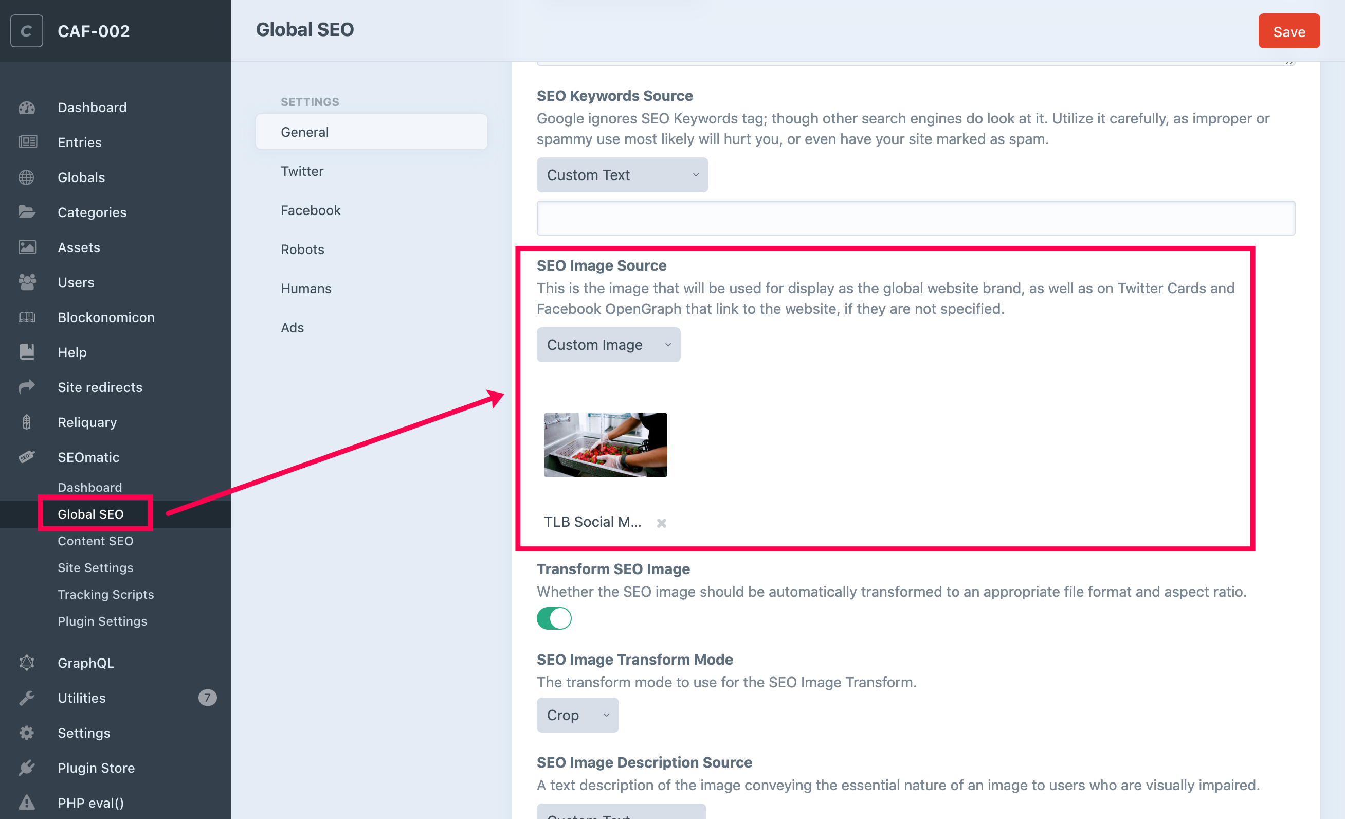
SEO Global Social Media Image
This is the image that will be used for display as the global website brand, as well as on Twitter Cards and Facebook OpenGraphs that link to the website. In order to change the SEO Global Social Media Image do the following:
- From Craft's Left Side Rail slick on "SEOmatic" displaying a few more options below.
- Select "Global SEO" from this list.
- On the page that appears, scroll down to the section that says "SEO Image Source"
- Click the "X" that appears next to the current images file name.
- Upload your new image.
- Once the image appears select the red "Save" button in the top right corner.
Click here to access a visual reference.
Your site currently has custom social media images uploaded for each page. Click here or here for how to update the image. For all new pages created you will need to follow these tutorials in order to update the social media image to be custom.
Affiliate Pop-up
If any of the conditions listed are met, the Affiliate Pop-up will trigger and a local storage variable is set on a users computer in order to prevent it from re-appearing again:
- If a user spends more than 30 seconds on the homepage, the popup will trigger. These are not consecutive seconds, meaning if they join, leave in 10 seconds and come back later, in 20 seconds it will trigger.
- If a user visits 3 "generic pages" on the next page view it will trigger. A generic page is determined by the template used in Craft. These are all the pages in the Page structure, and some of the misc pages. These are not the school recipes.
- If a user downloads 3 files, on the 3rd file it will trigger. A download is anything that is coming from the google storage drive -or- the horizon server. So if somebody downloads a poster image (JPG) that counts as a download. Same as if they download a poster image (PDF).
- If a user loads a recipe detail or case study (project produce entry) it will increase the special page counter by 1. If a user views 3 special pages it will trigger upon loading the page.
"Text Banner" Module
In order to have this module appear with reversed text (white text) you'll have to select one of the "Background Color" options found in the "Advanced Settings" area of the module. (Select any of the options except for either of the two "Gray" options.)
Featured Entries (Reliquary) Module
This module is a bit unique in that it will allow you to perform a search within the Supporting Research, Menu Cycles, Webinars and Trainings, Project Produce, Global Search, Management Tools & Resources, Procurement Tools & Resources, School Breakfast Tools & Resources, and Salad Bars Tools & Resources sections. You can then capture that search and place the results within this module on another page.
For instance, let's say you want to feature "Fruit" related Project Produce Grants on the Plant Forward page. You can add this module to the page and display the "Fruit" Kids Clubs results by doing the following:
- Open the page in the backend where you want to add the "Featured Entries (Reliquary)" Module.
- Fill in the "Heading" field with what you want the H2 in the frontend to say.
- Fill in the "Button" Text and "Hyperlink" Fields with the URL you want the button to take users to.
- Navigate to the Project Produce page in the frontend, type the word "Fruit" in the "Search" Field and hit "Submit"
- In the URL at top copy the entire string of letters & numbers of the URL past "s=" (It should look something like this "eyJvcHRpb25zIjpbeyJ2Y")
- Navigate back to the blank "Featured Entries (Reliquary)" module within your entry in the backend.
- Paste the recently copied text from the "Project Produce" page in the "Search URL" Field.
- Next, you'll fill out the Group ID. To do this, copy and paste "/cube/reliquary/groups" after the Site's URL. A page in the backend will appear.
- Click on the section you're searched for "Fruit" within. In this case, it's "Project Produce."
- A new page will appear. On the new page there will be a number at the end of the URL. For "Project Produce" it's the number "4"
- Navigate back to the blank "Featured Entries (Reliquary)" module within your entry in the backend.
- Enter "4" in the blank "Group ID" field.
- Finally, in "Max Results" type in the number of entries you want to appear on the page from the search. (Keep it to multiples of 3)
- Save your Entry and Refresh the page on the frontend to be sure it's appearing how desired.
Featured Entries (Manual) Module
This module allows you to add specific entries from anywhere on the site. To fill out this module do the following:
- Open the page in the backend where you want to add the "Featured Entries (Manual)" Module.
- Fill in the "Heading" field with what you want the H2 in the frontend to say.
- Fill in the "Button" Text and "Hyperlink" Fields with the URL you want the button to take users to.
- Select the "+Add an Entry" button and find the page or entry you want to add. You can add up to three.
Featured Entries (Automatic) Module
This module allows you to add a specific section and will populate the module with results that are automatically displayed. To fill out this module do the following:
- Open the page in the backend where you want to add the "Featured Entries (Manual)" Module.
- Fill in the "Heading" field with what you want the H2 in the frontend to say.
- Fill in the "Button" Text and "Hyperlink" Fields with the URL you want the button to take users to.
- Select one of the following sections for the entries to populate from: Supporting Research, Menu Cycles, Webinars and Trainings, Project Produce, Global Search, Management Tools & Resources, Procurement Tools & Resources, School Breakfast Tools & Resources, or Salad Bars Tools & Resources.
- Select if you want the entries to appear within the module either in "Ascending," "Descending," or "Random" order.
- Finally, specify the max number of results you want. (Keep it to multiples of 3)
Modules with "Background Color"
We typically recommend that when building out your page you toggle between modules that use a "Background Color" with modules that do not. This provides a visual break for users as they scroll down the page.
Below is an example of how this would work on an interior secondary page:
- Start out the page with the "Text Image" Module and set the "Advanced Settings -> Background Color" to "Dotted Gray".
- After the above, you would then switch to using a few modules that don't have a "Background Color" set so the background would thus be white.
- After the above, you would switch back to using a module or few modules that use the "Advanced Settings -> Background Color" set to "Dotted Teal."
We typically don't recommend stacking modules with different "Background Colors" on top of one another for a few reasons:
- Creates a visual overload for users.
- Large amounts of reversed type can be difficult for users to read.
- While the selected colors all blend together jumping around from color to color can become visually displeasing to the overall design of the page.
Image Usage Tips
Below you'll find a list of when we recommend using specific types of images throughout the website, as well as helpful padding amounts.
- Primary Section Overview Pages (ex. Management Overview, Procurement Overview, etc.) should utilize the "Image Banner" Module at the top of the page (see image size dimensions below).
- Secondary Overview Pages that introduce tertiary pages beneath them should also utilize the "Image Banner" Module at the top of the page (see image size dimensions below).
- Regular Secondary & Tertiary Pages should start out the page using the "Image and Text" module with the "Image" appearing first. This module should feature the following within it:
- A "Square-ish" sized image (see image size dimensions below)
- A H1 containing the name of the page
- An Intro Paragraph with the "Large Type" text style applied to it
- Larger: Equal
- Vertical Alignment: Top
- Text First Toggled to Off
- Advanced Options -> Width: Auto Extended
- Advanced Options -> Outer Top Spacing: 0
- Advanced Options -> Inner Top Spacing: 4
- Advanced Options -> Inner Bottom Spacing: 4
- Advanced Options -> Outer Bottom Spacing: 0
- Advanced Options-> Background Color: Dotted Gray
- Advanced Options -> Background Position: Center Center
- The module after this module will typically have its "Outer Top Spacing" set to 2 & "Inner Top Spacing" set to 0.
- An easy way to promote the next page within a section is to add one of the following modules at the end of your page just before the "Supporters" area in the footer:
- "Intro Image & Text" Module (NOTE: The Advanced Options -> Outer Bottom Spacing should be set to 0)
- "Promos Simple" Module
- "Promos Featured" Module
- The Image & Text With Link Grid Module should use a taller, vertical image (see image size dimensions below)
- If you're wanting to use a large image at the top of any page we recommend that you use the "Image Banner" Module (see image size dimensions below) vs. the "Image" Module. (NOTE: The Advanced Options -> Outer Top Spacing & Inner Top Spacing should be set to 0)
- A quick & easy way to break up the content on your page is to use the "Illustration Banner" Module featuring the image called "Illustration-Banner.jpg" (This can be found in the "Assets -> Images" area of the backend.)
Module Padding Tips
- For a module that uses a "Background Color" within the "Advanced Settings" we typically adjust the padding to be the following:
- Advanced Options -> Outer Top Spacing: 0
- Advanced Options -> Inner Top Spacing: 4
- Advanced Options -> Inner Bottom Spacing: 4
- Advanced Options -> Outer Bottom Spacing: 0
- The modules before and after this module will typically have their "Outer Top Spacing" & "Outer Bottom Spacing" set to 3.
- If you're using the "Image Banner" Module at the top of your page we typically adjust the padding to be the following:
- Advanced Options -> Outer Top Spacing: 0
- Advanced Options -> Inner Top Spacing: 0
- Advanced Options -> Inner Bottom Spacing: 0
- Advanced Options -> Outer Bottom Spacing: 0
- The module after this module will typically have its "Outer Top Spacing" set to 2 & "Inner Top Spacing" set to 0.
- The "Intro Image & Text" Module & "Image and Text With Link Grid" Module both utilize a little different type of padding setting than the other modules because the image breaks out of the background area. Because of this, we recommend using the following padding settings:
- Advanced Options -> Outer Top Spacing: 0
- Advanced Options -> Inner Top Spacing: 0
- Advanced Options -> Inner Bottom Spacing: 0
- Advanced Options -> Outer Bottom Spacing: 0
- The module before these modules will typically have its "Outer Bottom Spacing" set to 1 or 2. The module after these modules (if applicable) will typically have its "Outer Top Spacing" set to 3.
Image Sizes
Adhere to the following sizes for use on the site. All images should use a resolution of 72dpi and saved for web as a JPG that is 350kb or lower in file size:
Banners & Promos
- Homepage Banner Images = 3000px x 1500px
- Interior Banner Images = 3000px x 875px
- Square-ish Promos/Images = 1236 px x 1170 px
- Rectangle Promos/Images = 1236 px x 850
- Staff or Board of Director's Headshots = 1236 px x 1170 px
Module Specific
- Image and Text With Link Grid Module* = 1236 px x 1512 px
- Image Module = 3000 px x 1400 px
- Illustration Banner Module = 3848 px x 800 px (we recommend using the "Illustration-Banner.jpg" which can be found in the "Assets -> Images" area of the backend.)
- Text Module = 3000 px x 875 px
- Stats Module* = 3848 px x 1310 px
If you need a free online tool where you can upload and crop images you can use this free site found here: https://www.befunky.com/create/
*When used to house Tertiary Page Linkouts
Supporter Logo Size
Adhere to the following sizes for use on the site. We recommend that you center and adjust the size of each logo in relation to one another. The logo should not take up the whole space within the specified sizes as it will appear huge within the module. All should be at a resolution of 72dpi and saved for web as a PNG with a transparent background. Logos for the "Supporters" Bar in the footer should be reversed out to white:
- 800 px x 320 px
Illustration Sizes
Adhere to the following sizes for use on the site. We recommend that you center and adjust the size of each illustration in relation to one another. All illustrations should be a vector and saved for web at 72dpi as a JPG file.
For illustrations with transparent backgrounds, the illustration should not take up the whole space within the specified sizes as it will appear huge within the area where it lives. These should also be 72dpi and saved for web as a PNG with a transparent background:
- Square-ish Illustrations = 1236 px x 1170 px
- Rectangle Illustrations = 1236 px x 850
Icon Designations
Supporting Research Icons (Topics)
- Case Studies = Book w/ Bookmark
- District Innovations = Light Bulb
- Facilities = House w/ Leaf
- Farm to School = Pig
- Finance = $ in Circle
- Marketing = ABC w/ 3 Bars
- National School Breakfast Program = Apple
- National School Lunch Program = Fork & Spoon
- Nutrition Education = 3 Book Spines
- Policy = Bldg w/ 3 Columns
- Preschool = School Bell
- Procurement = Shopping Cart w/ Plus Sign
- Recipes = Pencil w/ Paper
- Research = Open Book
- Salad Bars = Leaf
- Training = Project Pull Down Screen w/ Up Line Chart
- USDA = USDA Text in Circle
- Default = Star
Webinar Icons (Media Type)
- Video & YouTube = Film Reel w/ Play Button Icon
- Photo = Image Icon
- PDF = PDF File Extension Icon
- Audio = Sound Icon
- Default = Star Icon
Project Produce Icons (Project Type)
- Rainbow Day = Rainbow Icon
- Tasting = Fork & Spoon Icon
- Farmer Visit = Wheat Icon
- Chef Demonstration = Apron Icon
- Farmers Market = Basket Icon
- Health Fair = Leaf Icon
- Harvest of the Month = Ribbon Icon
- After School Snack = Apple Icon
- Default = Star Icon
Recipes Overview
- Hot = Thermometer Icon
- Cold = Snowflake Icon
Misc. Icons Available
These aren't featured on any page, but are available for use in other collateral items.
- Excel = .XLS File Extension Icon
- Word = .DOC File Extension Icon
- External Link = Link Icon
Icon Sizes Featured on Card/Tile Pages
Adhere to the following sizes for use on the site. We recommend that you center and adjust the size of each icon in relation to one another. The icon should not take up the whole space within the specified sizes as it will appear huge within the area where it lives. All icons should be a vector graphic and saved out as a SVG file:
56 px x 56 px